Tuesday 18 November 2014

OUGD 602 - Greek food festival - Development

Developing the branding for this Greek festival food stall has been a process that has changed quite a bit. I want entirely happy with the way the branding was going, I felt it was too generic so I wanted to add some of my own influences into it. On one hand I have stated that the branding does need to be overly obvious due to the competitive nature of festival food stalls. The stalls need to be instantly recognisable for what they sell as so many people pass my every minute they need something that catches their eye.
Most of my research was based on my past experiences from the branding of food stalls which are usually very uninventive but effective. I wanted to take elements of this but also use quite a designed approach.

Coming up with a logo in this case isn't particularly important as the stalls usually speak for themselves.
For this brief I need to consider my target audience or more to point my target festival which in their own right have a target audience. Somewhere like Glastonbury attracts probably one of the widest audience for a british festival, because its been running so long it attracts basically every age demographic as there is something for everyone. As it is the biggest festival in the UK I think this would be the ideal place for the food stall.
I want to focus on the more luxury side of the festival in terms of branding but with the pricing I want to try and offer affordable food for the masses. Singling out an audience at a music festival I feel is a bad idea because profit maximisation is key, people will generally will go an eat what they feel like.

Ive been to quite a few music festivals so I feel for my self I am good primary research, I know what works and what doesn't and I feel from my own experiences I can capitalise one whats already out there. The main thing I have seen at festivals is the lack of healthy food or healthy food at a reasonable price. Comfort food is good for when your hungover but towards the end of the festival you do really feel the effects of chips and burgers.

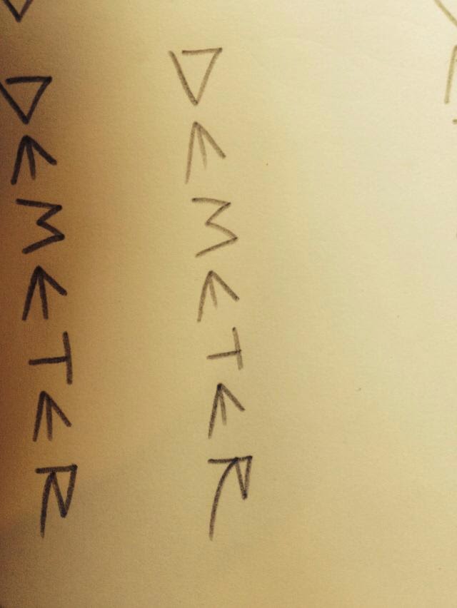
I started my branding with a logo, although I have stated that for the purposes of a festival logos dont seem to hold much significance I need something for the brand to revolve around. Demeter was the name I decided on so I came up with a couple of designs.


I narrowed down my logo design to include either the Greek flag, an olive or an olive branch. I looked into colour schemes, the obvious choice being the classic Greek blue. I want the brand to convey a message of freshness and organic so I started to use greens in the logo. from playing around with different variations of colours and logo design I wasn't entirely happy with the outcome.
I really want the stall to speak for its self in terms of what it sells so I didnt want the logo to be the main focal point. I decided to go down a different route with the logo and try just use the name on its own.


I first tried to draw out the name in Illustrator with the pen tool but I didnt want the logo to be too clean cut because I dont think it fits entirely with the brand.
The brand values I established at the start were -
Fresh
Healthy
Homemade
Value for money
Having done this I decided to write out the name hundreds of times using different pens to achieve a different line quality. I selected the few that worked and scanned them in to manipulate and align them properly.


This was the result I came up with for the logo. I tried to subtly use the font to convey Greek origin. Using an angular typeface is synonymous with their alphabet and classic greek script. I added in the colour to reenforce the Greek connection and I also tried to combine the original logo design of the olive which I also think worked well.

After establishing a logo the next thing I felt I should move on to was the look of the van or the packaging design. I felt the branding needed something extra to make it more personal, I felt all I could really do at the moment is to add the name and the the colour scheme to the branding.

I decided to go about making a series of illustrations that could go across the whole range of the branding and packaging, that can also be used with the logo. I thought about what I could draw and I remembered some work from an artist who iv'e known about for a while.
Hes an Illustrator called Ekta who produces weird geometric illustrations. I felt that there was a style that worked well to illustrate the greek costal buildings you see when your there. The buildings are tightly packed together on a hill usually and are classically painted with blue roofs.


Using Ekta as inspiration for my illustrations I created something more personal for my branding which I think fits well with how I want the branding to look like.

I made this illustration with the goal of putting it on the back of the t-shirts which would be worn as uniform, this is something I can easily make by screen printing.


I think as a t-shirt design it could look good.
This is the second illustration I made was for use on the sign, I think it would work on a large scale and I feel the illustration is enough attract attention. I made a couple variations of this but I feel this works the best


Monday 17 November 2014

OUGD 602 - Childrens book brief - Development

This brief is pretty straight forward yet time consuming. some of the illustrations because of the process have taken nearly an hour each to do, Im happy with the way they have turned out and I think they look good as a sequence. I feel I have established a good style and colour scheme.


I went with quite a large square format for the book, I have also looked at existing children's books to see what a successful format and layout looks like. I have a couple chapters left to illustrate then I can start to play around with the layout of the type.

One thing different with this book is the fact that it contains a lot more words usually than other illustrated childrens books I have looked at, I have thought about enlarging the type and spreading it over more pages but I feel this will detract from the story. The main thing Ive needed to consider with this book is who its going to be read by. Because of the high content of text its has left me with only one decision of aiming it at parents to read to their children. the illustrations are there just to paint a picture to the children of how the story develops.

I am happy with the progress of this book so far and I think when I start to play around with the text it will really bring the whole project together.

OUGD 602 - Rough guide to thailand - Development

Ive been categorising everything I need for the content of my guide to Thailand, Ive been talking to friends that have recently been adding on anything that they experienced when over there. Ive found that everyone who went for there first time had similar experiences in terms of places they visited and tips they found out.

The catagories I have narrowed it down to are -

First arriving
Places and prices
Getting around - bus, train, plane
Food
Renting mopeds
Activities
Suggested routes
Places to stay - hotels hostels
Culture
Temples
Top tips
Where to avoid
Crime and saftey

I wanted to keep the list quite short as I dont want this guide to turn into a huge book of everything there is to do in Thailand. I like the idea of presenting a rough guide because the point of traveling is doing it for yourself and having your own experiences. As far as I can see there are only a few published guide that have a similar way of looking at things.

I started to make some illustrations to go in my guide, originally I went for quite a clean style that I have used for previous projects. I liked the illustrations I was producing but I wanted to go for a style that looked like I had drawn it there as a traveller. I think this would tie in better with the guide as it makes it feel a bit more personal.


These are the illustrations I initially did, I like the detail and the fact I've used the classic buddhist style you see on the insides of temples interacting with the categories ive listed in my guide. To draw these became pretty time consuming but its something I want to develop because im not entirely happy with the way my other version has turned out.


These are the alternative illustrations I came up with, I decided to use a more sketched approach because I feel its more in keeping with the way I would like my guide to turn out. I drew the sketches with a pencil from pictures I took and also ones that existed in other travel guides and on the internet.

I started to put them onto the computer to digitise them so they could be put into the format I wanted.
I have looked at other guides and how they are laid out and one that caught my attention was the guide to Tokyo.


I like the concertina they used for this guide because I feel it makes a large proportion of the information available all at once. This layout also makes it easily transportable and the ability to include a large image like a map, something that I want to include on my guide.

With this format in mind I thought about the stock that I wanted to use, as its a travel guide its got to be quite hardwearing and not likely to break or rip easily. Being a guide for Thailand where a lot of people who go traveling from England will go when its the rainy season, this means that the paper its printed on will have to be waterproof or water resistance to an extent. The paper I had in mind was the fire proof paper available in the print room for around £6 for a A1 sheet. I think this used in a concertina or something similar will be ideal for this guide.

The fire proof paper is waterproof and is hard to tear, this said I will also have to produce a protective case or something similar. Maybe a see through pouch that could have a string through it for easy access.


I think some of illustrations work better than other and I feel I might have to re draw some of them but I think overall they work together quite well. I have experimented with overlaying colour and Thai text to add something more to the images. For the final design I would like to screen print it because on a large scale I think it will give me more control over the final design.