The briefs we were set were to design 12'' vinyl sleeve for a band who had outlined what they wanted the sleeve to contain in the brief. We were paired up with a partner after the presentation so I got Jane.
The idea behind the briefs were to complete them quickly as you might have to do working in a studio. Overall we had around 5 hours to complete the briefs creating a couple of examples for each one. For the 12'' sleeve we were told to represent the clicking noise that featured in the track that originally came from an old Russian defence system.
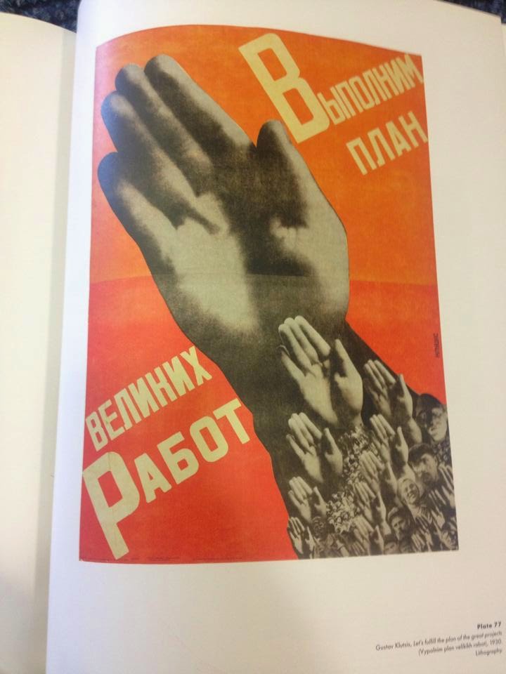
Me and jane started to look at old Russian images of satellites with the intention of creating a collage of images to use for the 12'' sleeve. After finding the images we liked we printed them out and started to arrange them. I went off to the library to do a quick bit of research on Russian imagery and I found a book that inspired me to create my collage. I noticed that a lot of old Russian adverts and propaganda we mostly made up of collaged images and I was told to look at a Russian designer Alexander Rodchenko.


Because we had so little time on each breif we had to work quickly and efficiently, we couldnt only generate a couple ideas but I felt they worked well. Me and Jane decided to create a digital version and a more hand rendered version.


This was Janes digital version which I also think worked well.
For the second brief we had to create a poster for a band which were playing at Krack studios in Manchester. We were already in the rhythm of created a work fast so this brief was easier than the first. This was another case of looking at the already existing poster for the band and also listening to there music. The music was pretty hectic and pretty much unbearable to listen to, Jane decided that thunderstorms would be a good starting point for the poster. We also identified that throughout most of the work done for the band contained concentric patterns.


For the poster i decided to use clouds as the background which I manipulated the colour in them to express the crazy nature of the music the band created.

The last two are examples of Janes work


The final brief was just to create a piece of art from anything, the only constraint in this brief was that it had to be printing a certain size piece of paper. the brief said be risky so I drew an illustration of a womans face and put it on an image of a topless woman, just because I felt like it.


Overall i thought the day was successful and I got some good work out of it, I also got some good feedback on the work I produced.